

I explained some time ago how the political and media classes have been captured by the biggest case of GroupThink in history. There was a better way as I showed HERE. And now I bring you one chart which should cause even the most zealous advocate of lockdown to change his or her mind. Remember that the effect of the lockdown policy has been to cause the biggest economic slowdown since 1665 which will, in itself, cause untold misery and deaths.
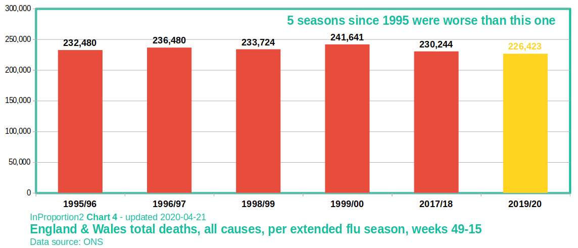
The chart below shows the total number of UK deaths during the worst five flu seasons since 1995. With Covid-19 deaths now tailing off you will see it doesn’t even make the top five.And why were there no calls for lockdown in those five peak flu years? And of course the UK population has grown rapidly since 1995 which makes this 6th place for Covid, in relative terms, even weaker.
And before you say lockdown saved us from Covid being much worse I refer you to Swedish data.
So again, I ask you GroupThinkers was the worst recession since 1665 really worth it?